

Task run analysis
The Task run analysis tool helps you to understand the execution performance of the task runs.
See the report structure and the drill down paths to explore the data details.
flowchart TD
  A[Endpoint data summary] --> B[Endpoint data viewer]
  B --> C[Task runs]
  B --> D[Data viewer]
  C --> E[Task history view + Log]
  G[Dashboard] --> E
  E --> F[Task step data snapshot]
  H[Task run summary] --> I[Task run viewer]
  I --> E
  J[<b>Task run analysis</b>]:::someclass -- Filter: Outliners only --> I
  K[Home screen Task run search] --> E
  classDef someclass fill:#ebf5eb
Task run analysis filter menu
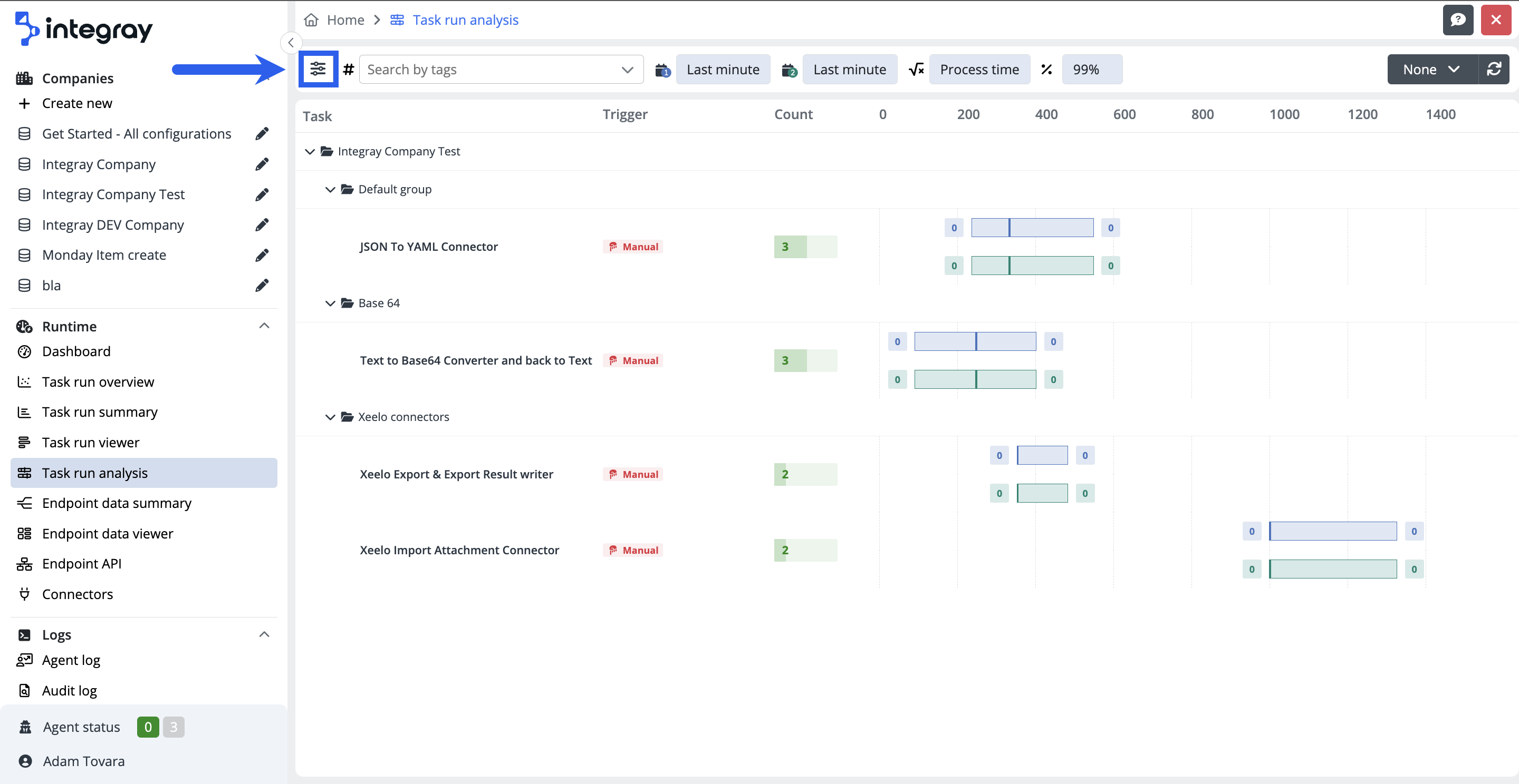
In the Task run analysis interface, you'll find three components. First, there is the filter button, which allows you to configure filters and opens a modal dialog window for filter settings. Adjacent to this button is a search field designed specifically for tag-based searches. Lastly, there are buttons related to the active and applied filters. On the right side, you'll also find a refresh button that allows you to manually update the overview. The overview can be automatically refreshed at a set frequency of 10 sec, 30 sec, 60 sec, or 5 min. If the frequency is set to "None," data refresh must be executed manually.

Task run analysis grid
Data are displayed in a tabular/grid format with the following columns:
-
Task - column with task is organized in a structured way displaying Company --> Task group --> Tasks.
-
Trigger - Displays the trigger for the respective task: Manual, Scheduled, GET, POST. More about the task triggers can be found in the Help center > Configuration > Tasks. If the task is triggered by an endpoint, additional information will be displayed in the Trigger column about the task run start: Method (POST / GET), Start task Synchronously or Asynchronously (Sync / Async) and the Endpoint name.
- Count - displays the number of task runs
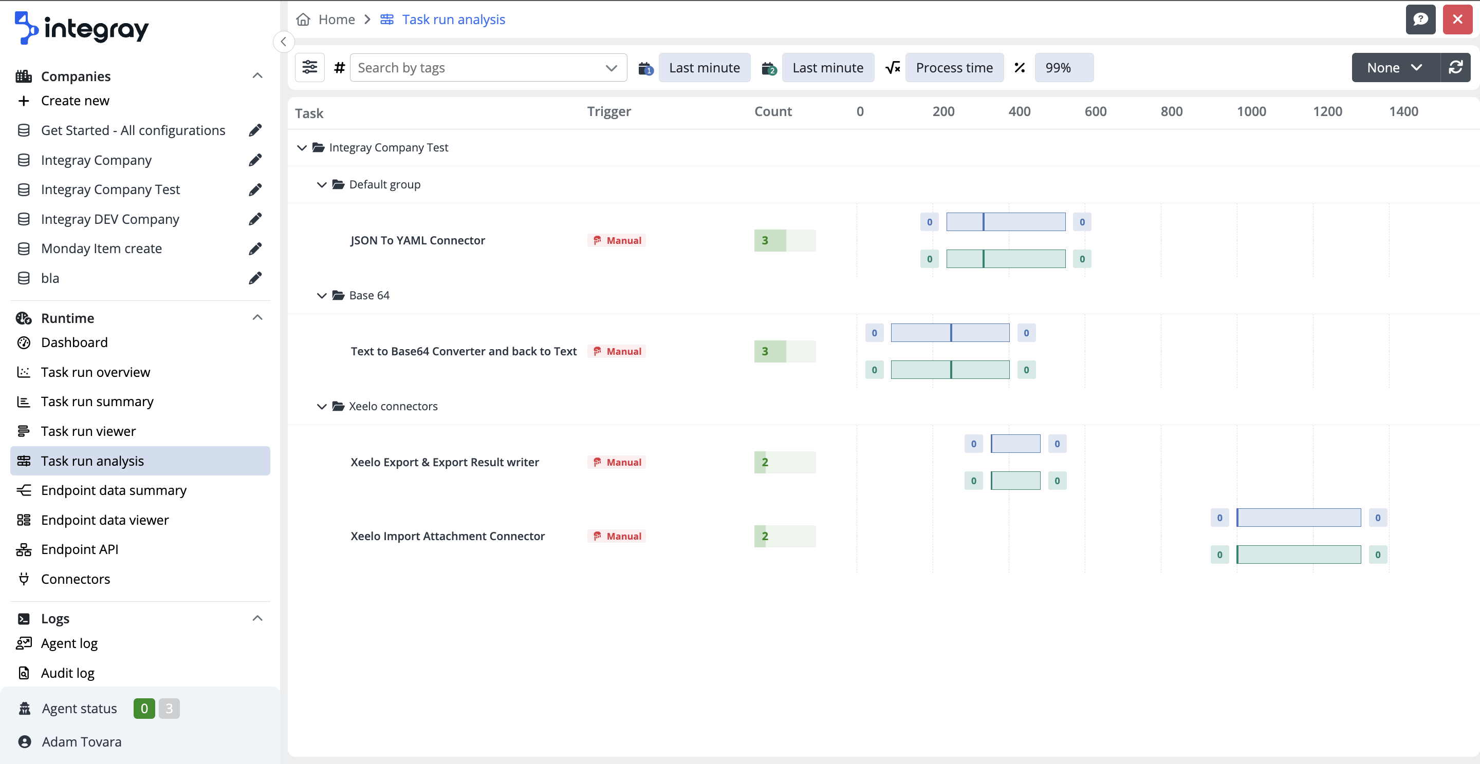
This tool utilizes the Box & whiskers plot a convenient way of visually displaying the task run data distribution through their quartiles. The box plot enables users to do a quick graphical examination of one or more data sets.
The whiskers - The lines extending from the boxes - indicate variability outside the lower and upper quartile.
The box - A box drawn from the first quartile (Q1) to the third quartile (Q3) with a vertical line inside to denote the median.
Box & whiskers plot elements:
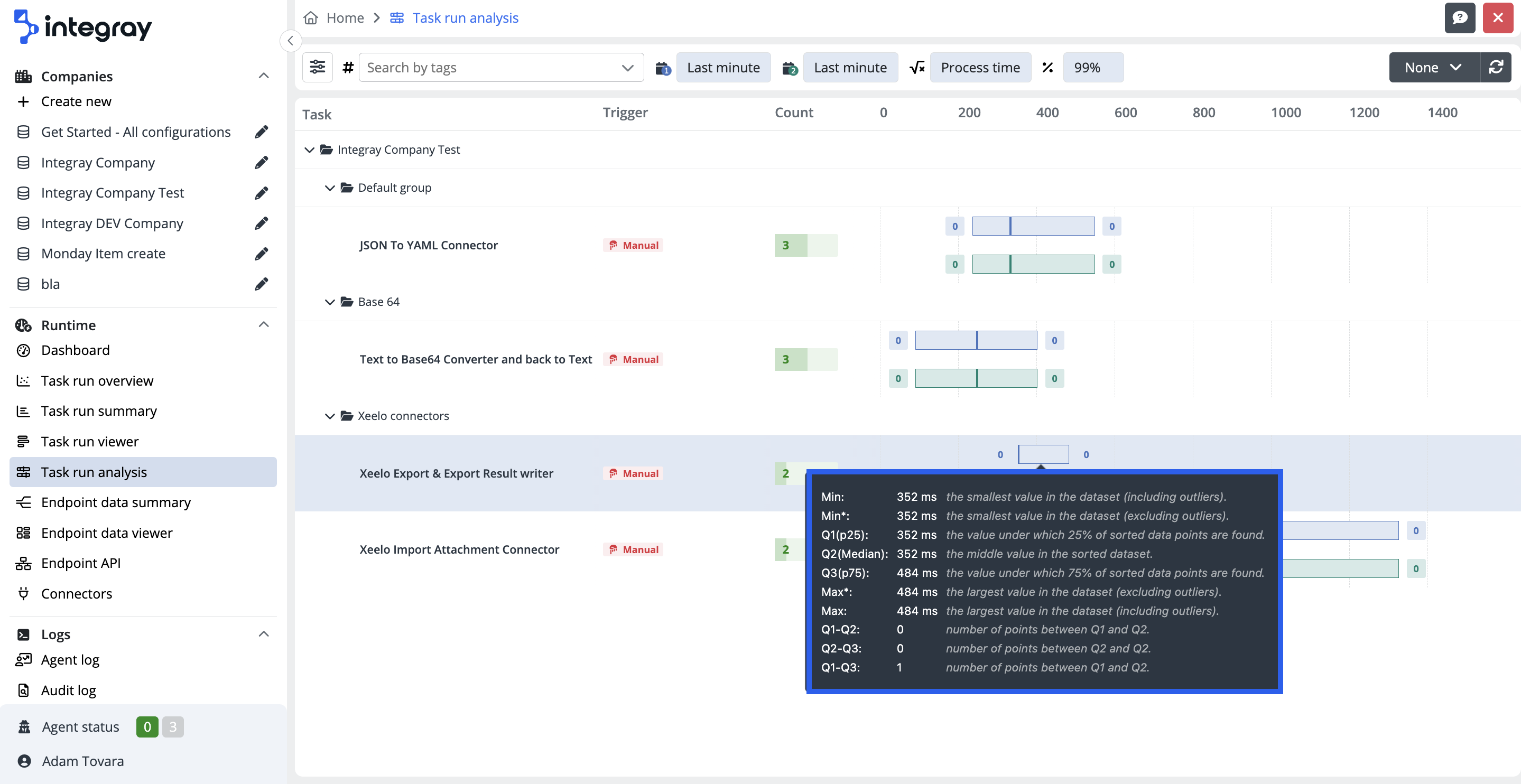
Minimum - 0th percentile - The minimum value including the outliners.
Minimum * - The minimum value excluding the outliners.
First quartile - 25th percentile.
Median - 50th percentile - The value in the middle of a data set, meaning that 50% of data points have a value smaller or equal to the median and 50% of data points have a value higher or equal to the median.
Third quartile - 75th percentile.
Maximum * - The maximum value excluding the outliners.
Maximum - 100th percentile - The maximum value including the outliners.
Click here to learn more about the box & whiskers plot.
Filters
The data set for the Task run analysis can be narrowed down to the required data set by using the built-in filters.
You can enter the built-in filters by clicking the sliders button on the left side of the endpoint data viewer filter menu and opening the modal dialog window Filter settings.
Built-in filters
You can narrow down the resulting data set by filtering within the following items: Task, Date range, Date range 2, Real Min/Max, Variables, Percentile

Task - This filters a single or more tasks, or filters the tasks of the entire company, or those of the task group.
Date range - The tool supports the comparison of 2 different periods. This sets the first date range for the task run analysis.
Date range 2 - The tool supports the comparison of 2 different periods. This sets the second date range for the task run analysis.
Real Min/Max - It is possible to Hide or Show the outliers (single values that differ significantly from the rest of the dataset) from the standard plot display. If Real Min/Max is set as Show, the outliners are excluded from the standard plot and are displayed separately at the end of the dotted whiskers based on the percemtile setting. The consequent box with the count number indicates the number of data points from the data set identified as outliners. By clicking on the outliners count box, the user will access the Task run viewer focused on the task runs marked as outliners only. If Real Min/Max is set as Hide, the outliners are included in the standard plot display.
Variables - here you can choose whether you want to analyse the Process time, Execution time or Waiting time:
- Process time - Sum of the waiting and the execution times.
- Execution time - The difference between the finished and started times of the task run.
- Waiting time - The difference between started and scheduled times of the task run.
Percentile - The definition of outliers can be affected by the value of the percentile combo box. The user can select from options:
-
99 -> outliners above 99th percentile -
97 -> outliners above 97th percentile -
95 -> outliners above 95th percentile
You can reset all the filters by clicking the Reset filters button in the left bottom corner of the Filter settings. The filter will be set to the default values.

Number of displayed tasks
The task run analysis can display up to 100 tasks. If the number of tasks to be displayed is greater than 100, you will be prompted by the system and asked to use the built-in filters to limit the set of displayed tasks.